
Flag Friday is a periodic discussion of the world's national flags; the project is explained and indexed here.
These discussions are about graphic design, and perhaps about nationalism and national symbolism in general. They should not be taken as critical of the countries, ideals, cultures, or people that the flags represent.
Lithuania

Parsons: Disliking "bad colours," he gives it a "B-", 65/100.
Michael5000: It's a little surprising to find red, gold, and green this far north, and assuredly Lithuania has never been a significant player in the pan-African movement. But that doesn't make the colors of its flag "bad." Just distinctive.

It's hard from this distance not to think of the Baltic States as a trio, and one thing I like about their flags is that they are all tricolors yet all immediately distinguishable both from each other and from the tricolor of neighboring macrostate Russia.
Grade: B+
Luxembourg

Parsons: Without comment, he gives it a "B", 70/100.
Michael5000: Hey, speaking of distinctiveness... Here's the schematic for the flag of Luxembourg:

...and here's one for the flag of neighboring Netherlands:
Luxembourg

Parsons: Without comment, he gives it a "B", 70/100.
Michael5000: Hey, speaking of distinctiveness... Here's the schematic for the flag of Luxembourg:

...and here's one for the flag of neighboring Netherlands:

Keeping in mind that both of these countries border on France, you can't help but wondering if the Luxembourgers might have come up with something that would make them stand apart a little more in the way of national symbols. In their defense, the design does have roots stretching back eight centuries. On the other hand, the flag wasn't made official until 1972, and at that late date maybe something more contemporary could have been done.
 |
| Michael5000's proposed more distinctive flag for Luxembourg |
Grade (for the current flag): B-
Macedonia
Macedonia
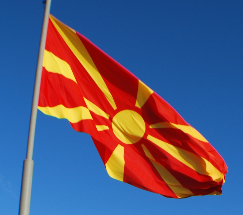
Parsons: "Looks unfortunately like a target," he says, but it's "original," which is worth a "C+", 60/100.
Michael5000: The Macedonian flag doesn't really look unfortunately like a target, which generally have an array of concentric circles rather than covering rays. No, the Macedonian flag looks unfortunately like the "Rising Sun" flag of fascist Imperial Japan. But that is not to be worried over, as modern Macedonia is rather remote from the tribulations of the Greater East Asian Co-Prosperity Sphere.

I actually like the Macedonian flag more than I thought I would when it was first unfurled. The red/yellow combination is unusual and highly distinctive. The radiating-rays design is a good one, and Macedonia's take on it goes a long ways towards rehabilitating the concept. So, a cautious thumbs-up for The State That We No Longer Have to Call the Former Yugoslav Republic of Macedonia.
Grade: B+
Madagascar

Parsons: This time, "original" is worth a "B", 73/100.
Michael5000: I quite like the subtle but simple geometry of the Malagasy flag, which combines three 2:1 rectangles into a simple 3:2 banner.

For some reason, the red, white, and green color scheme has always especially failed to say "Madagascar" to me -- maybe I'm subconsciously looking for some African gold or black in there -- but apparently they are colors with deep historical associations, so what the heck. In any case, it stands out among the African flags, and would stand out against the flags of its neighbors. Except, of course, Madagascar doesn't have neighbors.
Grade: B+
Grade: B+
Malawi

Parsons: Unhappy with "bad colours," he nevertheless gives it a "B", 70/100.
Michael5000: Malawi has undergone the world's second-most recent flag change (since superseded by Burma, but I expect that one will prove to be fairly temporary), and you no doubt followed the coverage here on the L&TM5K. Niece#3 did, and her subsequent current events paper for Global Studies not only got an "A", but also extra credit for covering a country that no one else had got to yet. But I digress. Parsons reviewed a substantially redder flag:

Here they are together, old and new.

And, apparently the new one is actually showing up in real life:

At first (politics aside) I disliked the new design, regarding it as something of a "dumbing down" of the old flag's unusual red-on-black scheme. Also, it must be said that the new sunburst, though single-color, does have a hell of a lot of fussy little pieces. That aside, I'm coming to recognize that Malawi Flag 2.0 remains distinctive and is really a little easier on the eyes.
Grade (for the current flag): B+
No comments:
Post a Comment