Showing posts with label The Flag Friday Project. Show all posts

Friday, May 6, 2011

Flag Friday XXVII


Flag Friday is a periodic discussion of the world's national flags; the project is explained and indexed here.

These discussions are about graphic design, and perhaps about nationalism and national symbolism in general. They should not be taken as critical of the countries, ideals, cultures, or people that the flags represent.


Nicaragua


Parsons: "It's probably lucky for Nicaragua that the vile choice of colours in this flag prevents me from seeing what's written on it."  He dislikes the "Writing," the "Bad Colours," the "Bad Shape" (?), and the "Graven Images," and gives it a "D", 40/100.

Michael5000: I've seen the Nicaraguan flag criticized somewhere for not only including the country's name, but it's address -- the text that Parsons could see reads "Republica de Nicaragua - America Central."  I tend to think of the flag of consisting of a blue-white-blue tricolor ("vile choice of colours"?) with a hoop of gold text surrounding a central triangle.  It's when you get into the triangle that things get fussy, pictorial, and strange, with a radiant "cap of freedom" hovering over a mountain range and under a volcano.  Trippy, and pretty much a total fail on the Betsy Ross front.

Grade: C-


Niger


Parsons: "Good Shape."   A "B-", 65/100.

Michael5000: I always likes it when a flag pops up that combines very simple elements in an unusual way, and Niger's circle-in-a-tricolor scheme is a great example.  It's only too bad that the colors are so close to those of India, which has a circle-like figure within its own tricolor.  Officially, Niger's flag has a 6:7 ratio, which is just about as bad a shape as you can get without giving up the rectangle.  Since no one, including the government of Niger (as opposed to the Nigerian government, which is interestingly something completely different) actually uses the almost-square layout, though, we can reasonably ignore it.

Grade: B+


Nigeria


Parsons: Calling it a "Bad Tricolour," Parsons nevertheless gives it a "B," 70/100.

Michael5000: Using common colors in a distinctive scheme that is immediately distinguishable from any other world flag, this is an excellent tricolor.  It's not incredibly exciting, but it embodies the important flaggy virtues.  Technically it's got the 1:2 ratio that we discovered last year is characteristic of former British colonies, but the online evidence suggests that it usually reverts to the 3:5 de facto standard.

Grade: A-


North Korea


Parsons: "The star is very well placed with regard to the shape of the whole flag," writes Parsons, "but the overall design is just somehow lacking in zest." Yet its "Good Shape" must count for something, because he gives it an "A-", 80/100.

Michael5000:  It's hard to find much to like about the DPRK, but their flag is pretty good.  Of course, I'm a sucker for white striplets.  The star-in-circle logo says "Texaco" to me, but I agree that having it offset inward is a nice touch.  And this is a rare occasion that I think 1:2 is a good choice of ratio.

Grade: A-


Norway


Parsons: Without comment, it gets a "B", 74/100.

Michael5000: The flag of Norway is more or less the opposite of the flag of Iceland.  And both of them are awesome.

Grade: A

Friday, April 22, 2011

Flag Friday XXVI


Flag Friday is a periodic discussion of the world's national flags; the project is explained and indexed here.

These discussions are about graphic design, and perhaps about nationalism and national symbolism in general. They should not be taken as critical of the countries, ideals, cultures, or people that the flags represent.


Namibia


Parsons: Without comment, the good doctor gives it a "B+", 75/100.

Michael5000: Namibia didn't manage to shake off of South Africa until 1990, so this is one of the more contemporary flags going in Africa.  I like it.  It's got all three primaries and green, which is pretty much an honorary primary, in a memorable and somehow friendly-seeming arrangement.  I guess it's the circle-and-triangles sun that makes it seem upbeat.  I bet some people will call it juvenile, but I think it stays on the dignified side of that line.  And everybody knows I'm a sucker for white stripelets.

Grade: A-


Nauru


Parsons: Disliking a "Corporate Logo" look but feeling that it has a "good shape" (?), the good doctor gives it a "C+", 60/100.

Michael5000: Parsons must not have realized that we're looking at a map here.  Aren't we?  Yes, I just checked, and that's the map of an island that lies just south of the Equator.  Since I don't share Parsons' dislike of maps on flags, that almost makes me want to like it.  Not going to happen, though.  Putting the dominant visual element in the bottom half of a flag, even though I understand the reason, raises my design hackles.  And it really does have a very Corporate Logo look.  This should be the banner of Nauru Airlines, not Nauru.

Grade: C-


Nepal


Parsons: With a "Bad Shape" but "Original," it ties with Nauru with a "C+", 60/100.

Michael5000: I have an absolutely terrific picture of some kids I work with, kids who grew up in refugee camps in Nepal, clustered around the Nepalese flag in the Hall of Flags on the Oregon State University campus, amazed to see such a familiar thing in such an unexpected context.  I'm not going to stick it online, for obvious reasons.  But, it's extremely cute.  

Yet even while I was taking the picture, I was wondering if it's really quite.... fair for Nepal to be quite so Bohemian (so to speak) in its flag design.  I mean, is that even properly a flag?  Innit more of a pendant?  Couldn't that design just been attached to a white field to make a still very distinct, but properly flag-shaped, national banner?


Hmm, I guess not.  It was worth a try, though.

Grade (for the real "flag"): C+


Netherlands


Parsons: No comments -- only a "B", 70/100.

Michael5000:   Back when we talked about Luxembourg, in addition making an embarrassing gaffe, I gave that little country's flag -- nearly identical to Netherland's -- a B-.  However, Luxembourg was getting graded down for creating a modern flag so easily confused with the very long-standing flag of a neighbor.  Very long-standing.  Very, very longstanding.  1572 longstanding.  This is, in fact, the original horizontal tricolor.  So where Luxembourg was derivative, the Netherlands is rocking an innovative design, and obviously one that has turned out to have some enduring appeal.  Got to respect that.

Grade: A


New Zealand


Parsons: Dr. Parsons can't be said to be too partial to the home team.  He dislikes the "Colonial Nonsense" of his own country's flag, and gives it only a "C", 55/100.

Michael5000: See Australia.  Mitigated by fewer and nicer stars.

Grade: C+

Friday, April 8, 2011

Flag Friday XXV


Flag Friday is a periodic discussion of the world's national flags; the project is explained and indexed here.

These discussions are about graphic design, and perhaps about nationalism and national symbolism in general. They should not be taken as critical of the countries, ideals, cultures, or people that the flags represent.


Monaco


Parsons: "Yawn..." writes Parsons.  "Nice shape, but nearly as boring as Libya."  Still, it gets a "B", 70/100.

Michael5000: This is pretty much the same flag as that of Indonesia.  Well, Indonesia is in the 2:3 ratio and Monaco is officially 4:5, but in practice Monaco usually gets tweaked to 2:3, so Bob's your uncle. I checked back to make sure I'm giving the two the same grade, and it looks like Parsons did too.

Grade: B-


Mongolia


Parsons: "Too Busy."   A "C+", 60/100.

Michael5000: Oh, I dunno.  The golden business on the inside panel (the "Soyombo") is a little complicated, but it's all in one color, the shapes are pretty big and simple, and it's an important national symbol.  It's no busier than, say, a set of five stars.  I like the coloration, and the red-light blue-red vertical tricolor base is pretty keen.  And it's got good distinctiveness and recognizability.  I'm liking the flag of Mongolia.

Grade: A-


Montenegro


Parsons: Montenegro has been something of an on-again, off-again country for the past eleven centuries.  It was not on the map when Parsons made his sweep, but it's on again as of June 2006.

Michael5000: Whoa, what century is this?  The flag of the newest (I think) country going looks decidedly like one of the flags of the world as depicted on a 1880s cigar box.  Or maybe like the lid of an 1880s cigar box.  Is that really the flag?


Yup, guess it is.  I'm going to give it points for distinctiveness, obviously -- although it's not a radical departure from neighboring Albania -- and, once we get used to Montenegro being on again, recognizability.  Also, the central device uses only a modest three colors, so it is capable of being rendered in applique as opposed to screenprinting -- extremely laboriously, though.  And obviously, there's a real traditional look here.  Let's see...  we'll give it a....

Grade (for the current flag): B


Morocco


Parsons: "Apart from the colours, this is a nice design," writes Parsons.  "Pentagram is a bit adolescent though."  It has "Bad Colours," it's "eye-watering," but it's "simple," and it gets a "B", 72/100.

Michael5000:   In fairness to the flag and peoples of Morocco, I don't believe that the pentagram had acquired its heavy-metal connotations at the time of their flag design, 1915.  This design, although hard on the red/green colorblind, is surprisingly distinctive -- I can't think of another open star out sides of Israel's off the bat, and that one is six-sided.

Grade: B


Mozambique


Parsons: Dr. Parsons is not a fan.  "Automatic weapons on a flag are especially bad," he says.  Appears to have been designed by a committee all of whom had stupid ideas for pictures of extra things to put on the flag. With "weapons" and "graven images" and being "too busy," it gets a "D-", 37/100.

Michael5000: Well, Mozambique has not had an easy road, and if I'd been part of the Portuguese colonial empire until the 1970s I might be inclined to put an automatic weapon on my flag too.  That being said, it true that it doesn't send a really upbeat message.  Parsons is moreover joined by the parliamentary opposition in Mozambique, who object not only to the bad vibes of the machine gun but also to the national flag consisting  of the symbols of the ruling party.  And yes, the stack of AK-47, hoe, book, and star really is a pretty busy business.

I like the white stripelets, though, and it doesn't look half bad on a flagpole:


Let's give it a:

Grade: B


Friday, February 18, 2011

Flag Friday XXIV


Flag Friday is a periodic discussion of the world's national flags; the project is explained and indexed here.

These discussions are about graphic design, and perhaps about nationalism and national symbolism in general. They should not be taken as critical of the countries, ideals, cultures, or people that the flags represent.


Mauritania


Parsons: It has "bad colours" but salvages a "B", 73/100.

Michael5000: How come I've never noticed the Mauritanian flag before?  It's pretty slick.  Plus, I like the colours.

Grade: A-


Mauritius


Parsons: "Hey, lots of countries have a tricolour," writes Parsons, speculating on the thought process behind this design.  "Why don't we have a quadricolor?  Big mistake."  With "bad colours" that "make [him] nauseous, it only escapes with a "C-", 50/100.

Michael5000: Going from the three stripes to the four stripes is such an obvious move that it would be surprising that more countries hadn't tried it -- or would be, if it just didn't look so wrong in execution.  Whether this is simply a product of everybody being accustomed to tricolors, or if there is something culturally or even biologically less satisfying about a series of four stripes, I could not speculate.  Clearly, picking the colors of IKEA children's toys don't especially help.  Slight mitigating factor: distinctiveness and recognizeability.

Grade: C-


Mexico


Parsons: With "graven images" and being "too busy," it barely tops Mauritius with a "C-", 70/100.

Michael5000: See, I almost have to recuse myself from looking at the banner of a next-door neighbor of my own country.  Clearly, the eagle-serpant-cactus-island retelling of the national origin myth is way too detailed to be properly flaggy, failing with gusto the Betsy Ross test and foiling all but the very most talented of child crayon artists.  And yet I am fond.  You have to admit that, as national seals go, it's a pretty boss national seal.

Grade: B


Micronesia


Parsons: Without comment, it gets a "B-", 66/100.

Michael5000: Pretty much the only thing I like here is that the stars are set so as to create a squarish negative shape in the center.  But beyond that, we have four white stars.  In a field of sky blue.  Boring enough on the page or screen, this thing must be essentially camoflaged when flown up on a flagpole.  On the up side, it won't really matter when the flag gets old and the color is all washed out; washed-out color is built into the design.

Grade: C-


Moldova


Parsons: With a trio of complaints -- a "bad shape," "graven images," and being "too busy," it barely tops Mexico with a "C," 45/100.

Michael5000: It is a bit leggy, being one of those 1:2 ratio flags despite the relative lack of British influence.  Moldova has deep cultural ties with neighboring Romania, and its flag is basically the Romanian tricolor with a seal on it.  The seal is undeniably busy, an eagle clutching something with each leg, and with a crest on its chest.  (It is, incidentally, an interesting convention of heraldry that makes it seem perfectly normal to represent birds of prey with crests on their chests.  Birds almost never bear heraldic crests on their chests in real life.  But I digress.)   But two things mitigate the busy-ness.  For one thing, the seal is graphically simple, and the entire flag is rendered in five colors plus black.  It's not especially kind on the local Betsy Ross, but if she's got her skillz she'll do fine.  The other thing is, the crest is of a cow with a moon, sun, and little flower.  I find this slightly enchanting.

Also: distinctive.  Romania and Chad are the only other two countries to fly an all-primaries tricolor, and neither of them have a cow.  Or any seal at all, for that matter.

Grade (for the current flag): B

Thursday, January 27, 2011

Flag Friday XXII


Flag Friday is a periodic discussion of the world's national flags; the project is explained and indexed here.

These discussions are about graphic design, and perhaps about nationalism and national symbolism in general. They should not be taken as critical of the countries, ideals, cultures, or people that the flags represent.


Lithuania


Parsons: Disliking "bad colours," he gives it a "B-", 65/100.

Michael5000: It's a little surprising to find red, gold, and green this far north, and assuredly Lithuania has never been a significant player in the pan-African movement.  But that doesn't make the colors of its flag "bad."  Just distinctive.


It's hard from this distance not to think of the Baltic States as a trio, and one thing I like about their flags is that they are all tricolors yet all immediately distinguishable both from each other and from the tricolor of neighboring macrostate Russia.

Grade: B+


Luxembourg


Parsons: Without comment, he gives it a "B", 70/100.

Michael5000: Hey, speaking of distinctiveness...  Here's the schematic for the flag of Luxembourg:


...and here's one for the flag of neighboring Netherlands:


Keeping in mind that both of these countries border on France, you can't help but wondering if the Luxembourgers might have come up with something that would make them stand apart a little more in the way of national symbols.  In their defense, the design does have roots stretching back eight centuries.  On the other hand, the flag wasn't made official until 1972, and at that late date maybe something more contemporary could have been done.  

Michael5000's proposed more distinctive flag for Luxembourg
Just a thought.

Grade (for the current flag): B-


Macedonia


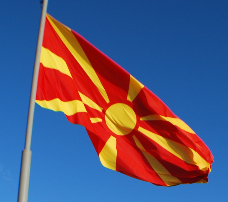
Parsons: "Looks unfortunately like a target," he says, but it's "original," which is worth a "C+", 60/100.

Michael5000: The Macedonian flag doesn't really look unfortunately like a target, which generally have an array of concentric circles rather than covering rays.  No, the Macedonian flag looks unfortunately like the "Rising Sun" flag of fascist Imperial Japan.  But that is not to be worried over, as modern Macedonia is rather remote from the tribulations of the Greater East Asian Co-Prosperity Sphere.


I actually like the Macedonian flag more than I thought I would when it was first unfurled.  The red/yellow combination is unusual and highly distinctive.  The radiating-rays design is a good one, and Macedonia's take on it goes a long ways towards rehabilitating the concept.  So, a cautious thumbs-up for The State That We No Longer Have to Call the Former Yugoslav Republic of Macedonia.

Grade: B+


Madagascar


Parsons: This time, "original" is worth a "B", 73/100.

Michael5000: I quite like the subtle but simple geometry of the Malagasy flag, which combines three 2:1 rectangles into a simple 3:2 banner.


For some reason, the red, white, and green color scheme has always especially failed to say "Madagascar" to me -- maybe I'm subconsciously looking for some African gold or black in there -- but apparently they are colors with deep historical associations, so what the heck.  In any case, it stands out among the African flags, and would stand out against the flags of its neighbors.  Except, of course, Madagascar doesn't have neighbors.

Grade: B+


Malawi


Parsons: Unhappy with "bad colours," he nevertheless gives it a "B", 70/100.

Michael5000: Malawi has undergone the world's second-most recent flag change (since superseded by Burma, but I expect that one will prove to be fairly temporary), and you no doubt followed the coverage here on the L&TM5K.  Niece#3 did, and her subsequent current events paper for Global Studies not only got an "A", but also extra credit for covering a country that no one else had got to yet.  But I digress.  Parsons reviewed a substantially redder flag:


Here they are together, old and new.

And, apparently the new one is actually showing up in real life:

At first (politics aside) I disliked the new design, regarding it as something of a "dumbing down" of the old flag's unusual red-on-black scheme.  Also, it must be said that the new sunburst, though single-color, does have a hell of a lot of fussy little pieces.  That aside, I'm coming to recognize that Malawi Flag 2.0 remains distinctive and is really a little easier on the eyes.

Grade (for the current flag): B+

Friday, January 14, 2011

Flag Friday XXI


Flag Friday is a periodic discussion of the world's national flags; the project is explained and indexed here.

These discussions are about graphic design, and perhaps about nationalism and national symbolism in general. They should not be taken as critical of the countries, ideals, cultures, or people that the flags represent.


Lebanon


Parsons: Disliking "graven images," he gives it a "C", 55/100.

Michael5000: Parsons and I share a healthy dislike of the kind of elaborate-national-seal-on-a-flag frimframery that stinks up some national flags (and a great many U.S. state flags).  I can't hold with him when he calls simple one-color shapes "graven images," though.  The Lebanese flag is a red-white-red tricolor with a wide center stripe and a green shape in the center; it passes the Betsy Ross test with (to use the unintentional pun for about the thousandth time) flying colors.  It's simple, dignified, and in the top ranks of recognizability.  I like it.

Grade: A-


Lesotho


Parsons: Disliking the "weapons" on Lesotho's flag, he gives it a "D", 55/100.

Michael5000: So I started out by thinking, "huh, I really like Lesotho's flag, I wonder why I haven't noticed it more before."  Then I read Parson's comment, and I was all like "'weapons?'  WTF?" But THEN I realized that Lesotho had a relatively recent flag change.  2006, in fact.  Here's a reminder of the old flag:


I think the change was a good idea.  The old flag was perhaps a bit more distinctive, but the new one has that classic tricolor charm.  The switch from brown to black was good.  As for the change of symbols, it's a nice gesture.  Quoth the BBC (Oct. 4, 2006):
The small mountain kingdom of Lesotho is marking its 40th anniversary of independence from the United Kingdom by flying a new more peaceful flag.
The military emblem of a shield, spear and knobkerrie is replaced by a traditional cone-shaped hat on the blue, white and green flag.
The hat worn by indigenous Basotho people was on the first independence flag but was replaced after a coup.
Lesotho says its new flag shows it "at peace with itself and its neighbours".
Probably they took Parsons' criticism to heart.  We flag critics have a lot of clout.

Grade (for the current flag): A-


Liberia


Parsons: It's "too busy" and represents "plagiarism," but "at least an improvement on the US flag."  He gives it a "B", 74/100.

Michael5000: Hmm, "plagiarism."  Y'all know about Liberia, right?  American abolitionists buy the freedom of a bunch of slaves and literally send them back to Africa, thus dislocating not only the freedmen from their North American homeland but also the African folks who happened to be living on the territory chosen for the project.  Good thinking, guys!  The repercussions are still in full swing.

So, "Liberia," liberty, freed slaves.  Capital: Monrovia, after U.S. President Monroe, under whose tenure the whole scheme was hatched.  And the flag is, yes derived from the United States'.  Under the circumstances, "plagiarism" seems a little hard.

At least an improvement on the US flag?  Hard to argue with that.

Grade: B+


Libya


Parsons: Asks "did you even try?" but calls it "original" and "simple" and gives it a "B", 70/100.

Michael5000: Green!  The color of Islam!  And Libya is not shy about announcing itself as an Islamic country.

If you're like me -- which seems unlikely -- you've always wondered what this simplest of flags really looks like in actual use.  Here it is on a ship:


And here's a bunch of them among some public buildings:


Kind of weird, isn't it.  They don't quite look like flags, but like a placeholder for some more conventional flag to be determined at a later date.  Which leads to the main problem with the Libyan flag: it's quite distinctive when you are looking at it on a table of "Flags of the World" or whatever.  Whereas, if you see it in real life, it's loses any sense of distinctiveness.  "Is that a flag, or just a piece of green fabric," you ask.  I have a set of sheets that are essentially Libyan flags, but no inferences regarding my attitude toward the North African state should be made based on this fact.

Grade: C


Liechtenstein


Parsons: Without comment, he consigns it to a "C", 56/100.

Michael5000: Sure, the crown is a little fussy, but hats off to the Liechtensteiners for altering their flag when they realized that it was the same as one of the many iterations of the Haitian banner.  That was class.  Also, the crown is a just one- or two- color geometric element, depending on where you look, and therefore relatively inoffensive. Too, isn't a nice anachronistic crown pretty appropriate for a geopolitical relict as cute as a European microstate?  Tell me this isn't charming:


Viva Liechtenstein!

Grade: B+